With a desire to diverge from the image of Formula 1, Prophet showcased the differences between the two in order to make Formula E individual.

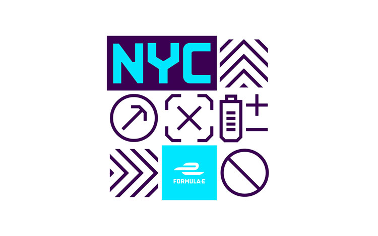
The branding highlights an innovative street racing experience by opting for bold and dynamic graphics, to attract a more mainstream audience that are drawn in by “this new, gritty form of motorsport. Street signs, road markings and fly posters inspired the visual style of the sport, whilst a revitalised colour palette gave the identity a much more modern aesthetic. “[an identity] imbued with confidence and the power of electricity.”
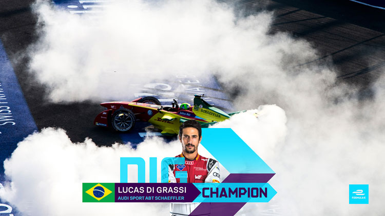
“We discovered that audiences are most drawn to the unpredictability and excitement that came from racing in the streets of iconic cities.”
Formula E quickly moves from city to city and needed branding that would translate with it, as well as rethinking its previously eco-friendly image. Instead, prophet, along with Formula E’s own design team, focused on speed, high-performance and pushing the electric nature of the cars and created a modern, fun identity that would engage with the younger generation of spectators.